
Revamping the user experience: Enhancing website content management for Investor Relations Officers
UX Research

Future UX vision: Clients can confidently preview and publish their website changes themselves in under 2 minutes.

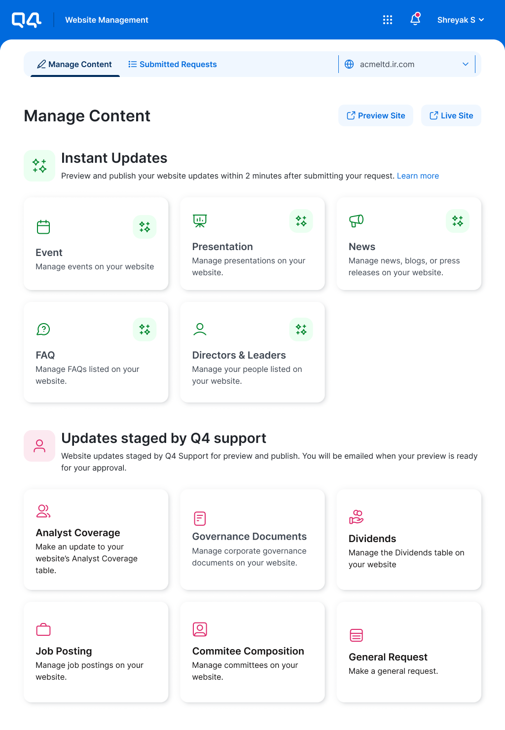
Current state of website management application: Clients have to wait for website changes to be applied manually after submission.
Summary
This initiative aimed to enhance Q4 Inc’s Website Management App (WMA) by automating the process by which users request website content changes and thereby reducing reliance on Support teams. A long-term UX vision needed to be defined for how this could be achieved. I conducted UX research, including audits, stakeholder interviews, and observation studies to identify key issues like visual clutter, lack of personalization, and unclear expectation setting. Collaborating with stakeholders, we developed and tested two design concepts, ultimately choosing a solution that caters to both tech-savvy and non-tech-savvy users. The final UX vision features a “website-builder” style interface with real-time previews and personalized elements, aligning with Q4’s long-term goals. We have completed the first milestone (redesigning the UI) and are planning additional UX updates for later in 2024.
Context
Q4 Inc’s Website Management App (WMA) allows Investor Relations Officers (IROs) to make content changes on their websites. The turnaround time for these changes varies based on the content type and complexity. "Express" changes are automatically published in minutes, while "Legacy" changes, requiring human intervention from the Support team, can take up to 2 hours. The long-term business goal is to reduce overhead costs on Support team resources by automating all content changes. To achieve this, the long-term UX goal was to provide a more consistent user experience and make all changes “Express.” To accomplish this, the WMA team needs to set a vision for the product's future direction.
My role
As the Product Designer for WMA, I spent the last quarter of 2023 conducting UX research to identify long-term opportunities for enhancing the user experience, in preparation for its transition to a new design system in 2024. I worked closely with Engineering, Product, and Leadership teams to define a future vision that aligned with both user needs and business goals.
The challenge
WMA is used by thousands of Q4 clients each quarter. My challenge was to find the most important problems to solve and to bring along my Leadership, Product Management, Engineering, and Design stakeholders throughout the process. Securing their buy-in was key, as the outcomes of this initiative would influence the product roadmap for the next 2 years. Effective communication and collaboration were key to aligning stakeholders and ensuring my recommendations were accepted and integrated into the strategic planning.
Aligning stakeholders on planned research
To secure buy-in from Leadership, Product Management, Design, and Engineering, I began by aligning them on my research plan. With just under 3 months to develop the UX vision, I focused my efforts accordingly.

Phase 1: Identify the high value problems
UX Audit & Stakeholder Interviews
I began by auditing WMA and interviewing key stakeholders to identify major UX improvements. I wanted to understand what they saw as areas of opportunity to make the experience more convenient for customers and reduce update publishing time.
Areas of opportunity to for UX improvements
Enable users to preview their changes as they work
Personalize the landing page/catalog view to reflect the user’s site setup & usage patterns
Ensure consistent UX patterns are used irrespective of the type of content
Improve consistency in language and voice across the application
Correctly set expectations upfront about the differences between Express and Legacy requests

Stakeholder interview synthesis on Dovetail

UX Audit & Interview synthesis on Miro
Review of existing customer feedback
I analyzed 312 instances of customer feedback from our in-app survey responses to dig deeper on major problem areas. I focused on responses received over the last 2 years where both qualitative and quantitative feedback was provided. I also closely looked at 50 customer quotes from this sample size to better understand where customers faced the most challenges.


Observation Study
I also spent 2 hours with Q4’s IRO and observed him using WMA to make updates to Q4’s website.
Key observations
IRO frequently switched between the live site and WMA, highlighting the need for real-time previews
IRO repeatedly re-read instructional text while scrolling through forms, showing a need for more intuitive UX guidance
IRO often refreshed his email for status updates after submitting requests, indicating a need for better notification emails

Initial problem areas identified
Interviewing stakeholders, auditing the UX, reviewing customer feedback, and observing IROs using WMA helped me identify 5 key problem areas. I then used interaction data from Pendo and Datadog to further narrow and prioritize these problems and present the most valuable ones to my stakeholders.
Initial list of problem areas

Prioritized problem areas
I used interaction data from Pendo and Datadog to identify high-value problems for stakeholders. They agreed that all three were worth addressing in the long-term UX vision, as each would enhance user experience by enabling more automated content changes without the need for Support team intervention.
Too much visual clutter - Reducing clutter would simplify the amount of information the user needs to process when interacting with the UI. As we automate more, displaying only relevant content and UI will be crucial to helping the user complete their tasks.
Lack of personalization - Tailoring form fields and catalog cards to the client’s website setup would ease content changes, especially when no Support team intervention is needed.
Unclear expectation setting - Improving clarity on content change turnaround times will reduce client frustration until full automation is achieved.

3 high value problem areas identified

#1 - Too much visual clutter

#2 - Lack of personalization

#3 - Unclear expectation setting
Phase 2: Ideate, validate, & define
Sketching out ideas
With 3 priority problem areas identified, I sketched out ideas for addressing them. In a collaborative workshop with my Design team, we explored four concepts: two innovative and two technically feasible. Stakeholder feedback favoured Concept #1, which aligned well with the long-term business goals of reducing overhead Support team costs. It was also a very familiar UX pattern and one more commonly used across website builders like Squarespace and Wix. View rough prototype for concept #1

User can live preview their changes as they work for quick and confident publishing.

Landing is personalized based on customer usage. User can manage each type of content as a list as opposed to adding/editing/removing separately.

Landing page is personalized based on customer usage and also provides upfront status updates on pending updates.

AI is leveraged to enable smart recommendations based on user activity. User can also used text inputs to start an update.
Low fidelity ideation and concept testing
After getting stakeholder alignment on the general direction I was taking the UX via the sketching exercise, I worked with another Product Designer to develop two variations of Concept 1:
Concept A (view the prototype): Designed for tech-savvy users, allowing direct interaction with site elements.
Concept B (view the prototype): Offered a guided experience for non-tech-savvy users, with changes managed via the left panel and impact visualized on the right.
Both variations were tested with 40 clients, revealing a slight preference for Concept B. This insight helped shape our strategy to accommodate both tech-savvy and non-tech-savvy users in the final design.

Clients would prefer to be able to interact with either the left panel or preview site to make website changes.

The left side UI should be focused on the content type or item within a section the user is editing.

Clients would like to be able to edit a specific item within a section of content by focusing on it through interaction with the preview site.

Clients would prefer to be able to show or hide the left panel and preview site based on their preferred editing style.
Finalized long term UX vision
Based on customer feedback from concept testing, I established the following UX vision. I reviewed this vision with stakeholders and secured their buy-in to start working with Product Management and Engineering to define milestones.

User lands on the dashboard and can see the information most important for them to begin working on site updates.

User can show/hide their preview site as need to begin making changes. Alternatively, they can also make changes using the left panel.

User can also show/hide the left panel to view and interact with the preview site in both full screen and responsive views.

User can select a specific content item to focus in on and can initiate content specific changes via the left or right panels.

(ADD ACTION) User can initiate content specific changes via the left or right panels.

(EDIT ACTION) User can initiate content specific changes via the left or right panels.

(FOCUSED EDIT ACTION) User can initiate changes for specific items within a content section via the left or right panels.

User can make multiple changes in bulk before deciding how they would like to publish them. Each change can be previewed via the right panel to ensure confidence prior to publish.

User's changes are pushed live per their publish preferences. They receive instant feedback from they system about this.
Next steps
With stakeholder alignment on the long-term UX vision, I collaborated with Engineering and Product partners to establish milestones. To start off, I am currently re-designing the UI for WMA using a new design system. Beyond this, we are currently working on shaping incremental UX changes to be introduced later in 2024 and beyond, working together to drive towards the future vision.

Current state
New UI retrofit