
Designing a stepper component for a new design system
UI Design • Design System Components

Background & Goals
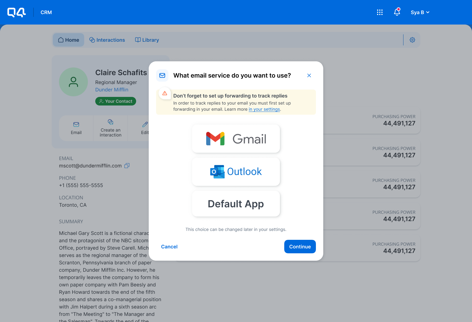
Q4 Inc underwent a major rebranding in mid-2023. While this meant a new logo, colour palette, tone, and a refreshed look and feel for the company, it also entailed a drastic transformation for Q4’s platform UI to align with the new brand. The Design team also saw this as an opportunity to refine the look and feel of the platform to ensure a consistent experience for users no matter which products they used. This meant the introduction a new design system with updated UI. Between December 2023 to April 1st 2024, I designed and shipped 5 components for the new design system - a few examples have been included below. All components were developed using Material UI (MUI) as a base.
For this project, I designed a stepper component for the new design system.

Card/elevated surface on desktop
Dialog/Modal on desktop
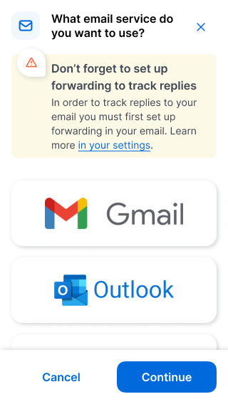
Dialog/Modal on mobile

Time picker
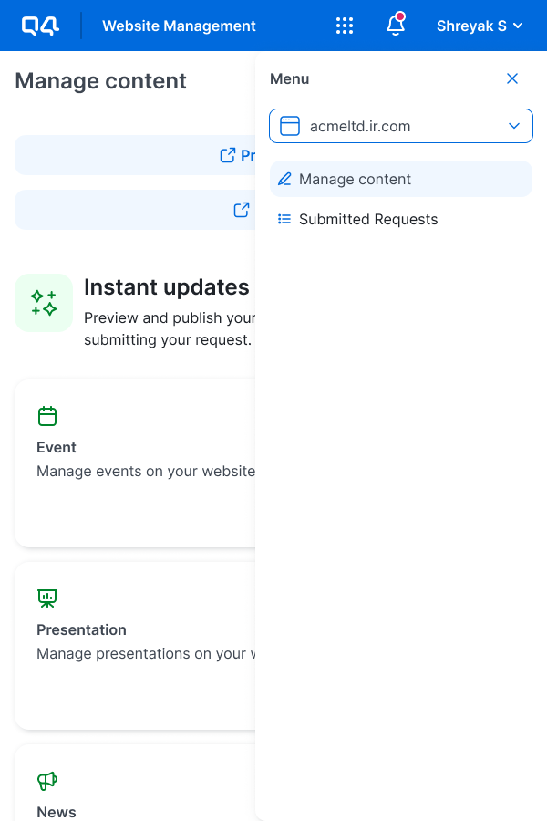
Website switcher dropdown on tablet
The problem
The current stepper component used in Q4’s website and event management management applications offered very little value to users. Interaction data from Pendo indicated that while users regularly used the stepper as a reference point to remember which step they were on, it was clicked 7 times a day on average. This indicated that users expected the stepper to be interactive and help them navigate the flow, which it was not designed to do. The current stepper also did not scale very well on mobile.
Did the new stepper component need to be interactive?
How prominent should the new stepper be in the context with the rest of the UI?
These were key considerations I kept in mind when exploring new UI.


Ideation of stepper UI
Reviewing MUI
I started by reviewing MUI to understand how their stepper component worked so as to guide my exploration. Key takeaways from this were:
Both non-interactive and interactive use cases can be supported using the MUI stepper.
The desktop and mobile experiences for the MUI stepper varied greatly. Examples below.

MUI stepper on desktop

MUI stepper on mobile
Inspiration gathering
I gathered inspiration from multiple online sources (i.e. Dribble) as well as applied examples (i.e. Amazon, USPS) to help ground my exploration in known/common UI patterns. The common theme that jumped out to me was that two types of steppers seem to be most commonly used:

Progress bar style steppers

Dot and line style steppers
UI exploration
I explored multiple variations of stepper component UI and ultimately landed on going further with a simplified progress bar style approach.
Why?
Better scaling of steps and labels on smaller screen sizes compared to dot land line style explorations.
Least interactive looking (Q4 products do not have any viable use cases for an interactive stepper so I decided to design a UI that would most help the user find their way around without looking too interactive).
Greater opportunity for a consistent experience across all screen sizes.

✅ Progress bar stepper - most scalable and minimalistic

❌ Large dot and line stepper - takes up too much vertical space and not scalable for mobile

❌ Pill and line stepper with completed steps summarizing user inputs - poor UX and responsive scalability

❌ Tiled stepper with current steps changing size for focus - not a common UI pattern for steppers

❌ Smaller dot and line stepper - not scalable for mobile
Finalized component
Once I decided to go with a progress bar style stepper, I sought feedback from fellow Designers and Developers to help tighten up the UI further and finalize how the new component would look and function.
Stepper on Desktop and Tablet breakpoints
👀 Animation: Steps would transition between colours using a smooth cross dissolve. While the desired animation was a “progress bar” like fill left to right within each step as the user progressed, early validation with Developers uncovered that this animation was not possible with the desired UI.
🔵 Colour treatment
A predominantly blue colour palette was used with the bolder blue used (in combination with a semibold font weight and corresponding icon) to keep the user focused on the step they are currently working on
A softer blue was used in combination with a green checkmark icon to let the user know which steps they have completed without pulling focus away from the user’s current step
A neutral grey colour was used together with a corresponding icon to let the user know which steps they have not started or navigated to

Stepper animation for desktop & tablet
Stepper on Mobile breakpoints
👀 Animation: Based on Developer feedback, the “progress bar” like fill left to right as the user progressed was achievable for the mobile variant of stepper given that MUI uses a very similar animation. I therefore instructed the team to reuse it.
🔵 Colour treatment
A predominantly blue colour palette was used for consistency with desktop and tablet variant
To reduce the amount of visual clutter on smaller screen sizes, the only icon shown was the green check mark in use cases where the user completed the flow
Additionally, a bold blue and semibold font weight was used to denote the current step whilst the right side provided affordance to the user in a neutral grey to indicate how many steps they had left
The only other colour used for the progress bar was the neutral grey so the user has a visual indication of how much of the flow they has left to go

MUI animation used for the mobile stepper variant.
Stepper responsiveness
The new stepper component scaled nicely across desktop, tablet and mobile.

(Desktop) Stepper applied to the event management application
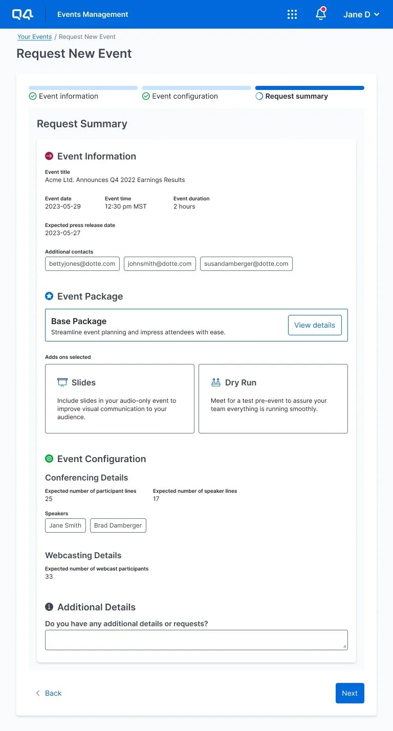
(Tablet) Stepper applied to the event management application

(Mobile) Stepper applied to the event management application
Evaluating the effectiveness of the stepper
Once the stepper component is developed and applied to the web and event management applications, I will be working closely with my Engineering team to ensure a custom CSS class/tag is assigned to the component. This way, I will be able to leverage Pendo to evaluate the following:
How often is the stepper interacted with by users? How does this compare to the current stepper?
How does this new stepper impact the time taken by the user to complete a flow?