
Redesigning Q4’s website management application UI
UI Design • Collaboration • Stakeholder Management

Summary
Q4 Inc. embarked on a major rebranding initiative, necessitating a complete overhaul of its Website Management Application (WMA) user interface. As the Product Designer for WMA, I led the redesign effort, aligning WMA with the company's new brand and a newly established Pebble design system. This involved carefully prioritizing screens, collaborating closely with engineering teams, and conducting thorough user research to inform design decisions. By modernizing the UI and improving usability we achieved greater consistency across the Q4 platform, enhancing user familiarity with the Q4 brand and reducing cognitive load. Furthermore, the project streamlined development processes, leading to a reduction in development time for new features. This successful redesign not only enhanced the user experience for thousands of Investor Relations Officers but also strengthened Q4's brand identity and positioned the company for continued growth.
Introduction
Q4 Inc.’s Website Management App (WMA) helps Investor Relations Officers (IROs) update their websites, crucial for communicating important information to investors. These updates significantly affect investor retention and attraction, impacting the company’s bottom line. Thousands of IROs use WMA each quarter to manage their website content efficiently.
In mid-2023, Q4 Inc began a major rebranding, which included a new logo, colour palette, and refreshed look and feel for the company. This rebranding required a complete overhaul of Q4’s platform UI to align with the new brand. The Product Design team saw this as an opportunity to refine the platform’s look and feel, introducing a new design system named Pebble (based on Material UI) to ensure a consistent user experience across all Q4 products, including WMA.
My role
As the Product Designer for WMA, I oversaw the transformation of WMA’s user interface to align with the company’s new brand. I collaborated with Product, Design, and Engineering teams to identify and design components from the new design system, plan their development, and coordinate implementation schedules. I designed new UI screens for key WMA flows, audited Developer implementations before they got merged, and managed a prioritized backlog of design gaps and bugs for post-launch. Additionally, I maintained constant alignment with Design, Product, and Engineering leadership on milestones, completion deadlines, and final checks before the new UI went live with customers.
Project scope
Design a brand new UI for WMA using the new design system, while preserving the current user experience as much as possible. Significant improvements could be made once the new UI was launched to customers.
📝 Project planning
Identifying screens to redesign
I started by listing out the key screens in WMA that I needed to create new designs for.

1️⃣ Landing Page: User starts here and selects the website content they want to update.

2️⃣ Submission form step 1: The user specifies what they want to change on their website.

3️⃣ Submission form step 2: User indicates how and when they want these website changes published.

4️⃣ Submission form step 3: Once the user submits their request, they are presented with a confirmation page.

5️⃣ User views their submitted request and can review, edit, and ultimately publish it when they are ready.
Prioritizing components that required redesign
I worked with another Product Designer to identify 12 new components that needed to be designed built for the UI redesign. I coordinated with the Engineering team to match these components to corresponding WMA screens and schedule their development. I set up a tracker in Miro visible to both Design and Engineering teams to keep everyone aligned on progress throughout the quarter.

Work back planning
I collaborated with Design, Product, and Engineering leadership to understand their expectations around milestones and completion timelines. Combining my understanding of this along with screen prioritization and the component list, I built a work back plan and secured alignment from my stakeholders before any work began. As leadership expectations were that the new UI be developed and tested for the entire app prior to release, it was agreed with the Engineering team that each part of the new UI developed would be hidden to customers until the entire thing was ready for launch.
I reached an agreement with my Engineering partners that once each set of screens of was implemented, I would collaborate with them closely to conduct regular Design QA reviews. Although the new UI was not set to be released until the entire UI redesign was completed, these regular reviews helped myself and my Developers ensure the work being done aligned as closely as possible to the designs.

🎨 Redesigning the landing page
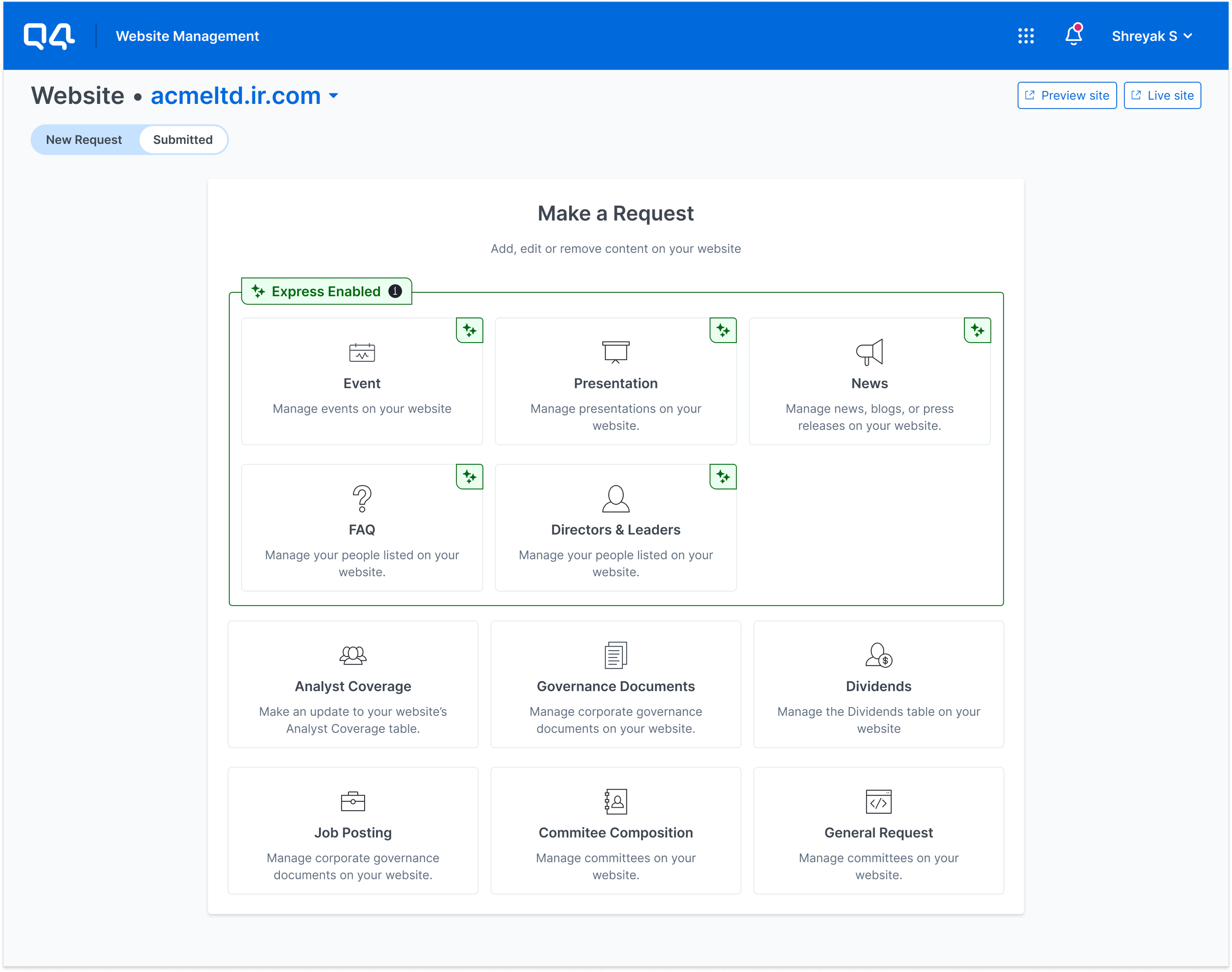
The landing page (also know as the catalog) is the first place in WMA that the customer lands on after signing into the Q4 platform. They can start by choosing the website content they want to update. I started with designing the new UI for the catalog as it was planned to go into development first.

Redesigned catalog
Old UI
Research
The old catalog contained an “Express Enabled” tag with an info icon meant to launch a tooltip with a link to a video. “Express” content types can be updated in a self-serve manner by customers without the need for a Q4 Support person to intervene.
I did some digging through interaction data in Datadog and noticed that in the last 90 day period, only 0.22% of users actually clicked on the “Express” info icon that launched a video walking through how express content gets published in an automated manner. This indicated that the tooltip and video was not the most effective way to show the difference between express and non-express/legacy content updates.
There was an opportunity to rethink how to make the difference between express and legacy content updates more apparent.

Ideation

1️⃣ I started by swapping out the existing components 1:1 with the Pebble components

2️⃣ I experimented with using alerts to separate the two kinds of content updates.

3️⃣ I also compared the use of alerts with using whitespace and typography.

4️⃣ Explored multiple versions to understand how best to make each set of cards visually distinctive yet cohesive at the same time.

5️⃣ Explored multiple versions to understand how best to make each set of cards visually distinctive yet cohesive at the same time.

6️⃣ Explored icon styling options

7️⃣ Explored and tested multiple card layouts

8️⃣ Conducted a co-design session with Design team to nail down hover UI and interactions.

⭐️ Finalized card UI
🎨 Redesigning the submitted requests page
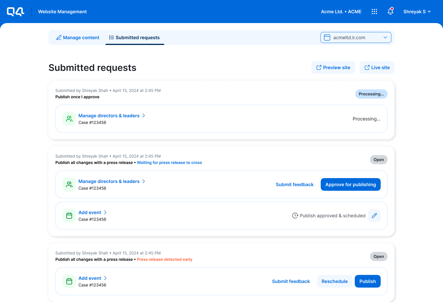
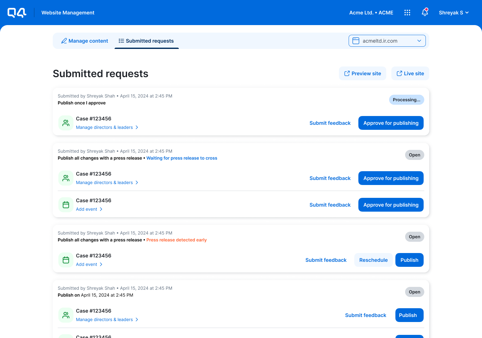
After the customer submits one or more requests to update their website content, they are able to view these submitted requests on a separate page in the application. The Submitted Requests page was prioritized next for development.

Redesigned submitted requests page

Old UI
Research
Some quick research in Datadog showed that users typically spent an average of 2-3 minutes in this page just to locate their action buttons (i.e. Publish). This indicated an opportunity to make small improvements to the visual hierarchy to at minimum make the content more scannable and action buttons easier to identify.
Ideation
1️⃣ I started by making 1:1 swaps with the Pebble components.

2️⃣ I noticed that there was a lot of visual clutter due to the accordions being nested inside the elevated cards. This was not helped by the fact that when expanded, the content within the accordions plus the nested boxes visual made it harder to discern individual bodies of information on the page
3️⃣ Use of key lines helped reduce visual clutter.

4️⃣ Considering that I learned from my earlier research that the difference between express and legacy content is not immediately apparent to customers, I explored using coloured tags to help users differentiate between the two types of requests when viewing their submitted requests.
🎨 Redesigning the submission form flow
To specify what an IRO wants updated on their website they need to fill out a firm based UI. This content change submission flow was the final piece prioritized for development. The Engineering team recommended that this flow be developed last as a lot of the components needed would already be built and/or implemented in WMA for the catalog and submitted requests pages.

Redesigned Submission form step 1

Submission form step 1 (Old UI)

Redesigned Submission form step 2

Submission form step 2 (Old UI)

Redesigned Submission form step 3

Submission form step 3 (Old UI)
Research
Having watched at least 60 different user session recordings in Posthog the previous year, a common theme I observed was that at least half our users spent far too much time reading copy and form fields to try and make sure they fill out the right things. This indicated an opportunity to reduce visual clutter where possible to make content easier to consume.
Ideation

1️⃣ As with Catalog and Submitted requests pages, I started with a one to one swap of the existing UI components with our new MUI components to start visualizing how everything was looking.

2️⃣ I then explored opportunities to streamline how multiple updates would stack as the user kept adding them on. I decided to use elevated cards to maintain separation between the different items. This also helped maintain visual separation as each card expanded or collapsed.

3️⃣ I then explored opportunities to streamline how multiple updates would stack as the user kept adding them on. I decided to use elevated cards to maintain separation between the different items. This also helped maintain visual separation as each card expanded or collapsed.
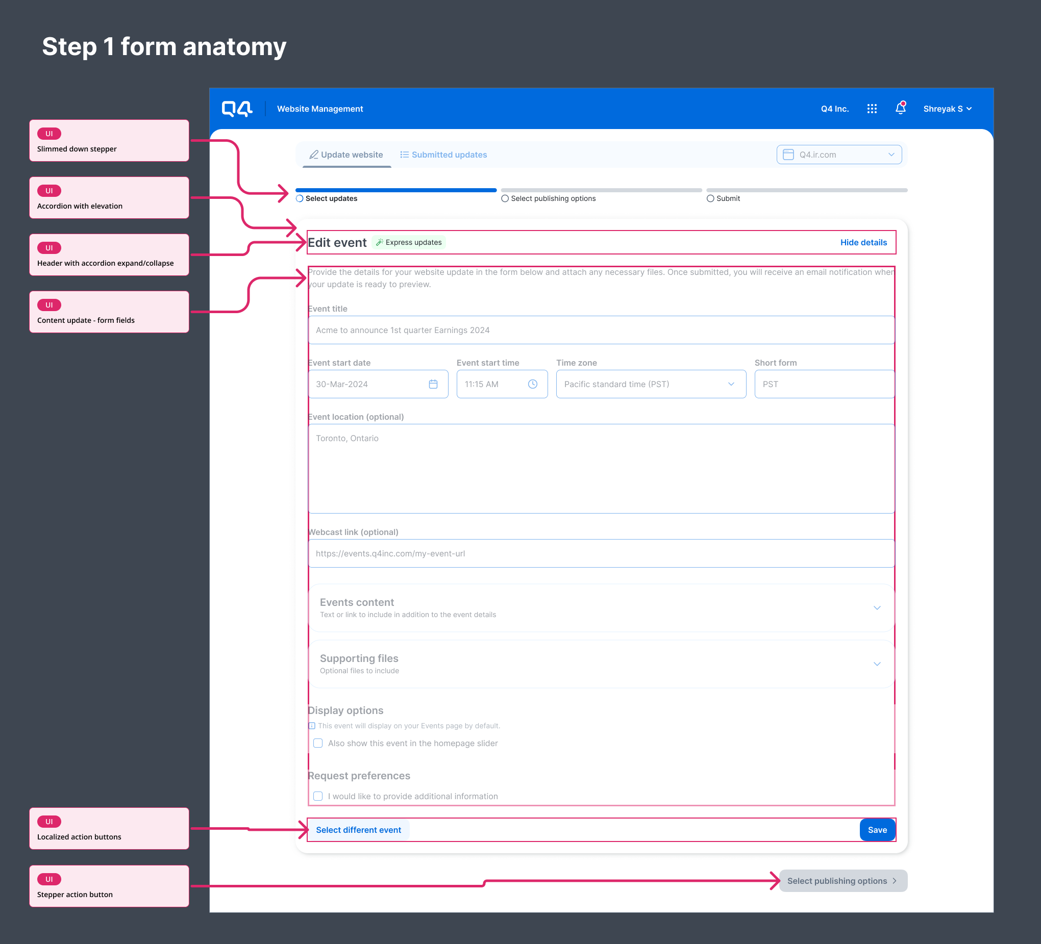
4️⃣ Factoring in visual and spatial hierarchy and responsiveness, I developed a general skeleton for how the submission flow form experience should be structured for all types of content update requests.
Design QA checks
As this part of the UI required the most retrofitting owing to the form related components being used across 11 different types of forms in WMA, I worked very closely with the Development team to heavily Design QA each type of form to ensure close alignment to the intended designs.
Notably, even after implementation there were at least 80 bugs and implementation gaps identified in the submission flow alone. Since we had little time to launch the new UI in front of customers, I partnered with my Design, Product, and Engineering leaders to prioritize these in a backlog. All 41 high priority bugs and gaps have been resolved as of January 2025.
Pre-launch auditing
Once all the key areas of the application had been switched over to the new design system by the Development team, the Engineering lead and I went through the entire application with a fine tooth comb to identify any areas that might have been missed. We worked quickly, collaborating in Miro to identify another 75 bugs or gaps that needed to be addressed by Developers. At this point, we only had another 2 weeks until the new UI was set to be launched to customers. I partnered with the Design lead to quickly prioritize the 75 bugs or gaps, ensuring only the critical ones were addressed before go live. Any areas of the application still using the old UI and critical bugs that blocked the user from proceeding with their tasks were considered critical. In this way, we reduced the number of bugs or gaps that needed to be resolved before launch down to 12 critical ones.

#1 - Sample of exercise run in Miro to identify low priority bugs/gaps

#2 - Sample of exercise run in Miro to identify content specific bugs/gaps

#3 - Sample of exercise run in Miro to identify CRITICAL bugs/gaps
Project impact post launch
This project had a significant impact on both user experience and business outcomes. By aligning WMA's UI with the Pebble design system, we achieved greater consistency across the Q4 platform, enhancing user familiarity with the Q4 brand and reducing cognitive load.
From a business perspective, the project contributed to a stronger brand identity and a more cohesive user experience across all Q4 applications. This unified design language strengthens brand recognition and reinforces Q4's position as a leading provider of integrated Investor Relations management solutions.
Furthermore, the adoption of the Pebble design system streamlined development processes and reduced maintenance costs by utilizing a shared component library. This efficiency translates to faster development cycles and quicker time-to-market for new features and improvements within WMA.
Reflection & learnings
Challenges
One of the primary challenges was the tight timeline for the project, requiring meticulous planning and close collaboration between Design, Product, and Engineering teams to ensure timely delivery. Coordinating the development and implementation of the new UI across the entire WMA application while maintaining existing functionality and minimizing disruption to users presented significant logistical hurdles. Additionally, identifying and resolving a large number of bugs and implementation gaps during the pre-launch auditing phase required significant effort and prioritization to ensure a smooth and successful launch.
Lessons learned
Data-Driven Design: Thorough research and data analysis, including analyzing Datadog and Posthog data, were crucial in informing design decisions and understanding user behavior.
Collaborative Development: Close collaboration and communication between Design, Product, and Engineering teams were essential for a smooth development process.
Pre-Launch Preparation: Comprehensive pre-launch auditing and rigorous testing were vital to identify and address potential issues before the new UI’s release.